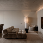
I redesigned the Puffy Lux product page to feel more premium and turn more visitors into buyers.
The brief. Luxury, without losing comfort.
Puffy's mission
Deliver an exceptional online shopping experience and, ultimately, a better night's sleep.
The challenge
Elevate Puffy in the luxury mattress category, while keeping the brand's core promise of comfort and quality.
What we are aiming for. Measured by A/B test.
add-to-cart rate, with the sticky cart card
bounce rate, with cleaner visuals and layout
time spent in the photo and video gallery
conversion rate, driven by video
weeks from research to final design
Expected impacts, set as hypotheses to A/B test before rolling out at scale.
What I did, in eight lines.
- 01Mapped the market
US mattress market, competition, and the shift of luxury toward wellness.
- 02Benchmarked 13 product pages
Mattress leaders and high-end brands: La Mer, Byredo, Dyson, Alo, Devialet, Hermès.
- 03Read the funnel
Found the leak: −38 pts between choosing a size and adding to cart.
- 04Built 5 personas and ran interviews
Turned each objection into a design requirement.
- 05Audited the current page
Visual noise, a technical configurator, and a buried “What's inside”.
- 06Ran UX and CRO workshops
Card sorting to rank what drives purchase, then keep / improve.
- 07Set a luxury art direction
Type pairing, restrained palette, square corners, night imagery, 3D mockups.
- 08Designed the new page and test plan
Sticky cart card, 3-photo layout, guided reading path, A/B hypotheses.
Same product. A different page.
Badges, banners and labels compete for attention. The eye has nowhere to land.
A dreamy night hero and two 3D technology visuals. A restrained palette that guides the eye.
Lux vs Royal reads as a features list: technical, no “why it matters”.
One clear upgrade line with the benefit and the price difference.
Eight large size tiles take a lot of space for little value.
The three most-sold sizes, then “more sizes” for the rest.
Far from the size choice, below the fold.
A sticky cart card with the offer, free gifts and split payment.
Trial and warranty badges scattered across the page.
A clean guarantee grid: 365-night trial, lifetime warranty, assembled in USA, free delivery.
Research, with AI as a sparring partner.
→ AI for fast context, then my own analysis
Puffy's mid-market space is being squeezed by Somnigroup's consolidation (Tempur Sealy + Mattress Firm).
The luxury niche is smaller, but grows faster in value than the rest of the market.
Gen Z and millennials are 84% more likely to increase wellness spend, and 64% say it comes out of their luxury budget.
BENCHMARK · 13 PRODUCT PAGES
- The eye guided by color toward one or two actions
- Product shot, texture and a quantified benefit above the fold
- A sticky “Add to cart”
- Video in first position, and minimalism everywhere else
Data and users, before pixels.
↓ −38 pts: the leak is here
Dataset provided for the study: 118,400 desktop sessions, 6.3% conversion, $2,385 average order value.
- A 38-point gap between choosing a size and adding to cart
- The upgrade module is the most-viewed zone, but only 6% interact with it
- Strong interest in photos and in the trial / warranty badges
- Few clicks on “See what's inside”: a design problem, not a lack of interest
PERSONAS
| Persona | Profile | How they buy |
|---|---|---|
| Sarah, the busy one | 34 · Marketing manager | Discovers on mobile at lunch, finishes on desktop at work. Sensitive to reviews and the 365-night trial. |
| Marc, the comparator | 45 · Engineer | Opens 6 to 8 tabs (Puffy, Nectar, Saatva). Visits 4 times over 9 days. Reads the whole Lux/Royal table. |
| Jennifer & Tom, the young couple | 29 / 31 · Moving house | Looking for a King for their new home. Very sensitive to promo codes and shipping fees. |
| David, the pragmatic luxury buyer | 52 · Executive director | Clicks the Lux → Royal upgrade from an email and buys in a single 4-minute session. |
| Amy, the wellness seeker | 38 · Wellness coach | Arrives from a search for “cooling hybrid mattress”. Reads the cooling technology section in detail. |
UX INTERVIEWS · WHAT BLOCKED THEM
“I picked King, then panicked: is $2,749 the final price, or does delivery cost extra?”→ Make size and price clearer
“We weren't sure a King box would fit our stairs, so we closed the tab to go measure.”→ Make size easier to understand
“Once I picked the size, I wanted to know exactly when it would arrive. We move in 3 weeks.”→ Show delivery info during discovery
“Is it actually cooling enough for someone who sleeps hot? The copy is vague.”→ Make the copy more specific
“I wanted to see it next to the Saatva, side by side, not just read specs.”Out of scope for this page
“Everything felt fine, I just got distracted by a Slack message and never came back.”Attention gap, not an objection
The current page, under the loupe.
- 1Too much visual noise. Awards, banners and labels everywhere: the eye isn't guided toward one or two clear actions.
- 2A configurator that lists, not sells. Lux vs Royal reads as a technical features list, with no “why it matters”.
- 3“See what's inside” is buried. It is our best tool to explain the difference, and it is barely visible.
- 4A gallery that takes effort. Thumbnails are small, and the scroll control sits opposite the main actions.
Workshops. Deciding what earns its place.
What makes people buy, not just discover the product?
What already converts, and what must change?
TO KEEP
- Free upgrade (upsell)
- Reassurance
- Free bundle
- Reviews
TO ADD OR IMPROVE
- Split payment, more visible
- Sticky, more visible “Add to cart”
- Copywriting
→ these became the brief for the layout
Art direction. The codes of luxury.
To land a stronger luxury positioning, cutting-edge product imagery has to meet refined, elevated design.
Canela (serif) for elegance, Gilroy (sans) for innovation. Mixing both in one phrase is a world-class signature.
Puffy Lux mattress
White, black and a touch of mocha for warmth. Color guides the eye, it never competes with the visuals.
An underrated tip: square, or barely rounded, corners read as premium, as at Hermès or Louis Vuitton.
A night scene in a refined interior with a calm couple creates desire. 3D mockups on a fading background then build credibility.
A clean grid with fine dividers for the 365-night trial and lifetime warranty: a white-glove feeling.
Contrast, real text titles, clear hierarchy, no forced video autoplay.
The new page, built to guide.
- 01Three zones and a sticky cart card. Instant clarity, and less distance between step 2 (size) and step 3 (cart).
- 02Three photos right away. One dreamy hero for the ideal scenario, two innovative shots for the benefits.
- 03The right UI for sizes. Most orders are Twin, Queen or King: show those three, then a “more sizes” button, inspired by Louis Vuitton.
- 04Workshop results applied. Cart, reassurance, certifications and benefits first; size and price made explicit.
- →A Z-pattern reading path. The hero sets the tone, the title confirms the product, the colored size CTA sits right above the price, the 3D mockups add proof, and “Add to cart” closes the loop.
- →A 3-second test. Which elements do you remember? The answer should be the path we designed: hero, title, size, cart.
- →Nothing to hunt for. What it is, what it does, what it costs and what the offer includes, in that order.
Expected impact, to prove with A/B tests.
“Add to cart” is always visible, and color contrast guides the eye from size to cart.
+10% add-to-cart rateEasier to understand the product and what's included, with a higher perception of quality.
−5 pts bounce rate · target: 80% of a 120-client panel rate it more prestigiousA more prominent play button, ideally autoplay on the first gallery image: video erases doubts and convinces.
+20% time on gallery · +3% conversionMore emotion, clearer understanding, benefits that land and an offer that's hard to walk away from. Every change pushes toward one goal: more people adding to cart.
Next project
André AI →