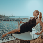
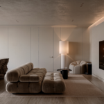
I created the brand and website of ABN Architecture, a Paris studio renovating hotels and residences.
The brief. A studio that needed a face.
The client
A Paris architecture and design studio, part of ABN Building Corporation, renovating hotels and residences.
The challenge
Build a brand that reassures owners and hoteliers: premium design, but also on time, on budget and stress-free.
Founder interview, before any pixel.
I started with a UX interview of the founder to define the vision, the values, the services and the ideal client. Every brand and website decision came from it.
Branding workshop, with the team.
A remote workshop with the ABN team to agree on the brand's personality: each participant voted for the values that define the studio.
Logo exploration, three routes.
Three directions, each with its own idea, tested in context before choosing. The final logo is the refined wordmark: precision, elegance, simplicity, with a line that says “with you, from start to finish”.
What I created, from logo to launch.
Everything, end to end: the client got one consistent brand, from the logo to the last line of copy.
A distinctive mark and its variations, light and dark.
Palette, typography and rules that hold the brand together.
Every page designed, desktop and mobile.
Built and launched, ready for the client to update.
The words on every page, in the brand's voice.
The imagery that carries the brand online.
The voice, in a few lines.
Copy written to sound like the studio: calm, precise, reassuring.
“We design desirable and sustainable living spaces.”The promise, in the hero
“All the design, none of the stress and logistics.”The reassurance for owners and hoteliers
“Every project is unique, and made to measure.”The craft, project after project
The website, built to convert.
One page that answers the questions a hotel owner asks, in the right order.
→ reassurance first, then proof, then one clear contact
The work, room by room.
A brand as calm and precise as the spaces it designs.
Next project
Keys & Roc →